I’ve only spent a few hours with Android 16’s overhauled design, and I already love it
Even before the dust had settled from the Google I/O 2025 Keynote, I discovered that I could download the Android 16 QPR1 Beta, before stable Android 16 even hits phones. I was actually kind of surprised, simply because there’s usually a delay between the end of the event and when the servers go live. Thankfully, that wasn’t the case this time around, even if the download itself took quite a while.
Even after Material 3 Expressive was announced during The Android Show, I didn’t really have any feelings one way or another. Sure, it was cool to see Google making massive improvements, but I just figured it would result in subtle tweaks to the UI.
Boy, was I wrong.
Big changes (and some bugs) right out of the gate

It doesn’t take long to see any changes, as they’re immediately apparent right when the phone finishes rebooting. Upon noticing that, I did something that I haven’t done in a couple of years: I stopped doing what I was doing and explored the software.
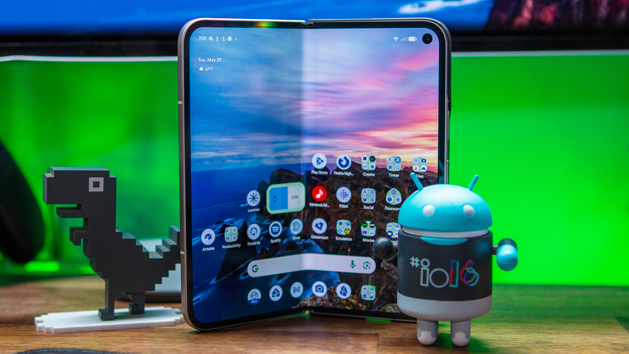
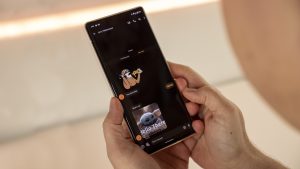
Android 16 QPR1 Beta 1 feels almost completely different from the Android 16 Beta 4.1 build that I was using prior. For one, I’m a big fan of the font change. There’s just something about it that’s nice to look at, and it fits well with the rest of the interface.
Customization is front and center, and it all starts with the Wallpaper & Style settings. This interface has received a much-needed facelift, and Google absolutely nailed it.

It didn’t take long to be reminded that I was using beta software, as I’ve already encountered a couple of bugs.
The first is that I seem to be missing a couple of the Home Screen layout options. I can only choose either “Small” or “Medium,” but I am apparently missing “Large” and “XL.” The other bug that I found was when I was trying to pick a wallpaper from a Google Photos album.
Several times, I would pick a wallpaper and decide against it only after seeing the preview. And while it technically took me to the previous page, the Photo Picker and “Wallpaper” screens would get combined. Instead of messing around with it more, I just ended up going into the Photos app and setting the wallpaper from there.
No Desktop Mode (yet), but there’s something else

Next, I jumped into the Settings app, as one does, to try and see if Desktop Mode was available. However, I was immediately thrown off by the colorful icons that now appear alongside each of the primary settings pages. No, it’s not a big deal, but it was unexpected and something else I would rather enjoy.
Unfortunately, my hopes for Desktop Mode with QPR1 Beta 1 were dashed. After double-checking the Developer Options and coming up empty, I decided to just plug the Pixel 9 Pro Fold into an external monitor. Sadly, all I had was the option to mirror the screen, which is the same behavior as previous Android builds.
While disappointing, another surprise greeted me when I opened the app switcher. Each app has its own label in the top left corner of the preview window, but when you tap that, you’re presented with a drop-down context menu.
I was disappointed with the lack of a default Desktop Mode, but it didn’t take long to move on and find something else new.
From here, you have a few options, such as using it in split screen mode, taking a screenshot, or selecting objects and text to copy, share, save, or look up with Google Lens. It’s yet again, another one of those changes that I didn’t expect, but am happy to see.
More surprises

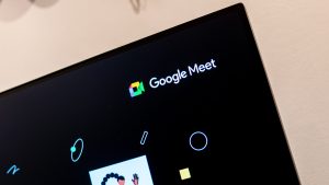
I spent a little while longer diving through menus and seeing what looked different, what was new. At one point, I accidentally activated Gemini, only to be greeted with two new buttons above the Gemini bar — Share screen with Live and Ask about screen.
You just have to grant access to either “Share entire screen” or “Share one app”. Once granted, you’ll see a menu appear at the top of the screen that looks like you’re on a phone call. But from here, just start asking questions, and Gemini will help you out.

Lastly, I noticed that the Quick Tiles in the Notification Shade were also updated, but it turns out there’s more to it. Android Central managing editor Derrek Lee informed me that the Tiles are resizable, so you can have four toggles in a row instead of just two. That’s something he’s very excited about.
I did try to see if it would let me adjust the size of one toggle so it would span an entire row, but no dice. Seeing as this is just Beta 1, maybe Google will make that possible with a future update.
Unexpected feelings

Whenever a company releases a new software version, most of the time, I just keep an eye out for any feature additions or changes. That was the mindset that I went into I/O 2025 with, but as luck would have it, I’m coming out on the other side feeling completely different.
I think Google is making the right design choices, putting even more of a focus on personalizing your device. There’s nothing more personal than your phone, and I’m happy to see Android 16 embrace that idea with Material 3 Expressive. Now, I just have to hope that Desktop Mode will show up sooner rather than later.


Post Comment