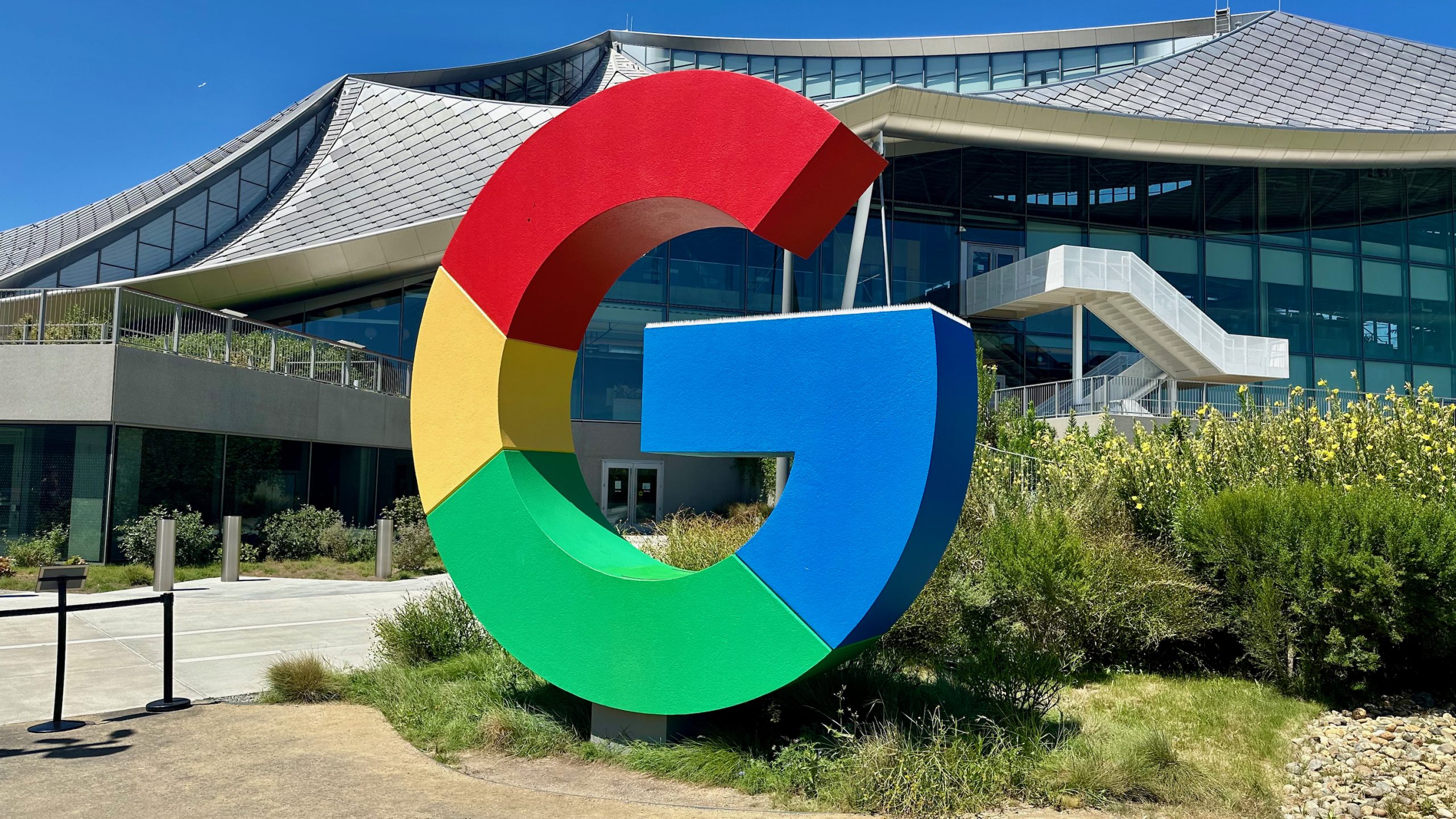
Google’s refreshed gradient logo is a pop of bright, vivid color
What you need to know
- Google has been spotted changing its “G” logo for its mobile app, making it a little more colorful and vibrant.
- The change, spotted on Apple’s App Store, brings a gradient that seamlessly blends Google’s multi-colors with one another.
- The change has yet to appear on the Play Store; however, it has reportedly been spotted in the Google app’s beta.
You might not have noticed, but Google’s starting to give its classic “G” logo a bit of a colorful refresh.
Spotted by 9to5Google, the standard multi-colored “G” logo, present on the main Google app on mobile, looks slightly different, per an App Store update. The “G” is still present — even in the same “font,” you could say — however, the key difference is its color style. Google has moved away from its clear, distinct sections for red, yellow, green, and blue.
Instead, Apple’s App Store shows these colors blending in a more gradient style.
It’s also worth mentioning that the colors briefly take on a different tone before turning into Google’s next signature hue. For example, as the red blends into yellow, it’s briefly orange, which is what you’d get if you were still taking art class. Yellow and green create a lime-ish green, while green and blue almost make a turquoise color.
This change appeared on the App Store for iOS devices early this week, but Android has yet to receive it. The Play Store is still displaying the (now) old logo. The publication notes that the logo gradient rolled out to the Google app in beta. It’s not yet clear when Android users will see it more widely.
Google’s been a Busy Bee

The 9to5 post also notes that this is the first time (in 10 years) Google has done anything to its “G” logo since changing it into what we’ve come to know. The publication reminds us of the old lowercase “g” against a blue background before the company’s app redesign to uppercase in September 2015.
There’s also the old Gmail logo, which underwent a font redesign in 2020. The app moved away from the red “M” against an envelope to an “M” that stands on its own with Google’s multi-colored design. That change also took a little while before it was everywhere, so Google’s behavior in the present day isn’t too strange.
A few months earlier in 2020, Google Photos picked up a logo redesign that made its pinwheel logo a little less sharp. Previously, the multi-colored pinwheel felt more geometrical, offering straighter edges and sharper points. However, in the summer of 2020, Google opted to soften those edges, as it took on a more “modern” appeal.
Interestingly, this change comes at a time when Google’s Android Show is discussing everything new and exciting coming to the OS. Among the updates was talk of Material 3 Expressive, Android’s new major design overhaul. There’s a chance Google could look to bring this gradient look to more apps, as 9to5 notes, but only time will tell.


Post Comment