Google unveils the most massive Android redesign ever
What you need to know
- Google’s new design language for Android, called M3 Expressive, focuses on making designs that feel good, make sense, and help you get things done, using color, shape, size, motion, and containment to guide your focus.
- The goal is to build interfaces that connect with users on a deeper, emotional level.
- Google plans to reveal this big design shift at the I/O developer conference.
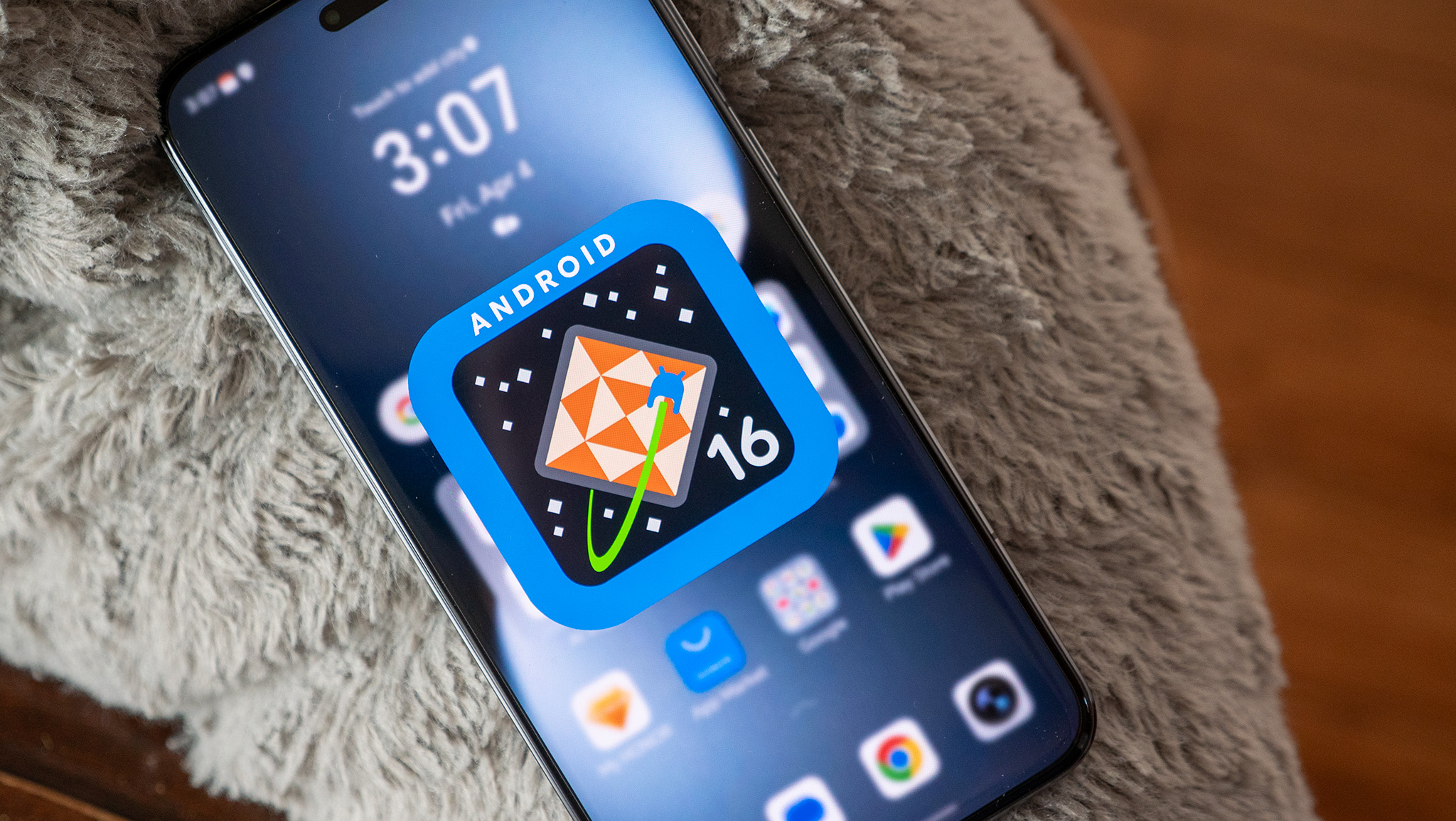
If your phone or favorite app suddenly looks a little more stylish, colorful, and friendlier, it’s probably thanks to Google’s new design update it’s calling Material 3 Expressive.
At the upcoming I/O developer conference, Google is set to officially show off the next big chapter in Android’s design story, which got leaked earlier this month. It’s not just giving it a fresh coat of paint — the company is switching things up in a big way.
In a fresh blog post, Google explains that M3 Expressive is all about design that feels good, makes sense, and helps you do what you came to do. It leans on five key ingredients, such as color, shape, size, motion, and containment to subtly steer your attention to the stuff that actually matters on your screen.

Design with feels
The new design direction aims to build interfaces that actually connect with users on a deeper, more emotional level. Big shifts like this don’t just change how Android looks, but also change how app developers build and shape their apps too.
Google is hyping M3 Expressive as its most heavily tested design system ever, and it has the numbers to back it up. After 46 rounds of design tweaks and feedback from over 18,000 people, the company has landed on a style that leans hard on color, shape, size, and motion to make everything feel smoother and easier to use.
The tech giant conducted its research to look into what grabbed people’s attention in a design, how different visual styles made them feel, and how quickly they could figure out what an interface was supposed to do.
Speed demon mode
Google also went into the specifics with its testing, like figuring out which progress bar made wait times feel shorter, or how big a button should be to hit it easily without covering up the rest of the screen. It even dug into how different loading animations mess with our sense of time while waiting.
The Mountain View-based company claims that Material 3 Expressive helps users spot key interface elements up to four times faster than the old Material 3 design. Additionally, it levels the playing field across age groups, with users over 45 finding interface elements just as quickly as younger folks, as per Google.


Post Comment